This short demonstration gives an overview of the supported features of our iPad app.
Overview of the User Interface
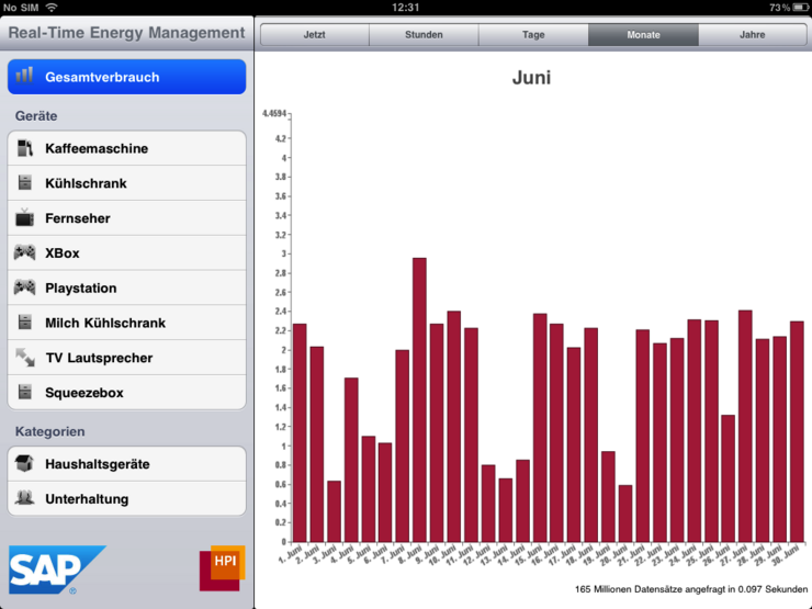
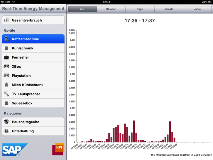
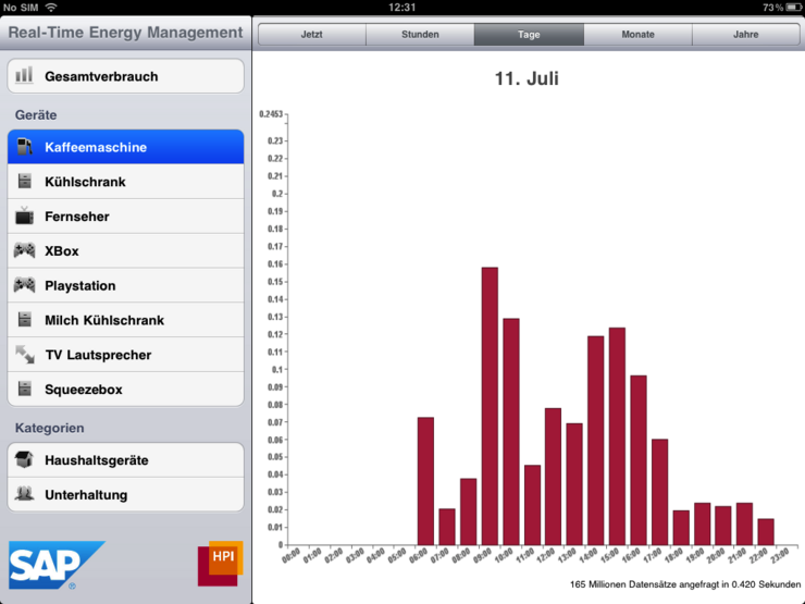
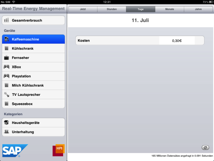
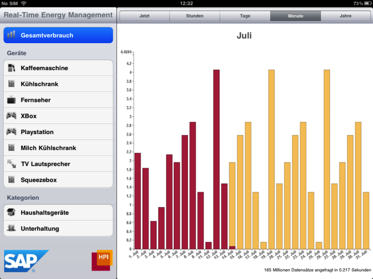
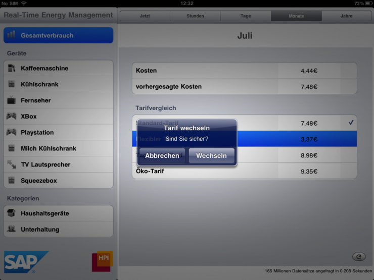
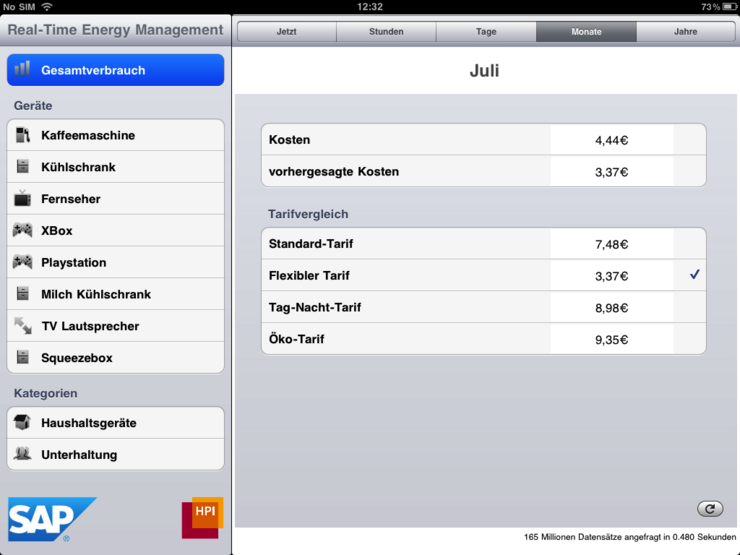
The iPad app essentially consists of four parts. In the left column we have a list of the different devices like the coffee machine. We can also select categories which each include multiple devices and - furthermore - we can switch to the overall consumption of our exemplary household. In the right part we can see the energy consumption diagram for the chosen device(s). The detail level of this diagram can be adjusted above it by selecting whether we want to see the consumption of a whole year, or a month, day, etc. Below the diagram brief information about how many data was processed in which time to plot the graph is given.